There are several points here. It's really off topic for this thread [about impacts], but I'll respond to them briefly, so we can bury this one quickly and permanently.
Contrary to what you assert, if you took the unadjusted data, you'd find that the temperature rise in the raw data would be 0.5C higher than the adjusted data. Adjusting the data thus reinforces the skeptical storyline!
Adjusting data is important since we're dealing with more than a century of weather station data some of which have physically moved, changed their instrumentation, been subjected to urban heat island effects, etc. This is
why the data is being adjusted.
The
general methodology as well as the
raw data is
publicly available for anyone who cares to google it and educate themselves.
If you want to go into details,
the paper with the new results describing
how the data was adjusted is also
publicly available!
In short, there's pretty much enough public information and data available for a lifetime of study.
Note that this is but one paper/study which the media and the denialists are blowing out of proportion and we, as good scientists, should not immediately fall prey to the "this changes everything"-syndrome whenever a new paper is published but put it in its proper perspective. In fact, as I shall now show, this paper is not very revolutionary.
Putting things in context (which the public is prone not to do, a fact which denialists take full advantage of) makes it pretty clear that the hiatus argument was rather specious in the first place.
Thus all this paper does is to refute a weak denialist argument.
Why was it weak?
First, the hiatus was only seen in surface temperature data. However, if you look at total temperature data (surface+ocean+atmosphere) which is a better indicator of the global energy balance, there
never was any hiatus. If you look at any of the other trending indicators like precipitation, ice cover, ocean acidity, etc. there wasn't any hiatus either. Hence, if you only see a possible break in one indicator while all the other ones are still trending, what would you expect?
Second, from the scientific side, the hiatus or more accurately a decrease in the trend line (i.e. 'still getting worse, just not as fast as before'---which is quite different from 'getting better again') was mostly interesting in terms of understanding why the surface temperature was deviating from the other indicators. This was found to be due to changes in the ocean circulation as described in AR5.
The denialist argument for the pause was to cherrypick 1998, which was a strong El Nino year as the baseline, and claim that since annual surface temperatures hadn't exceed the 1998 value, global warming had paused. This argument worked on the public because the public likes soundbytes and slogans "No warming in 15 years!" more than they bother to actually look at the data.
And here's the graph ...
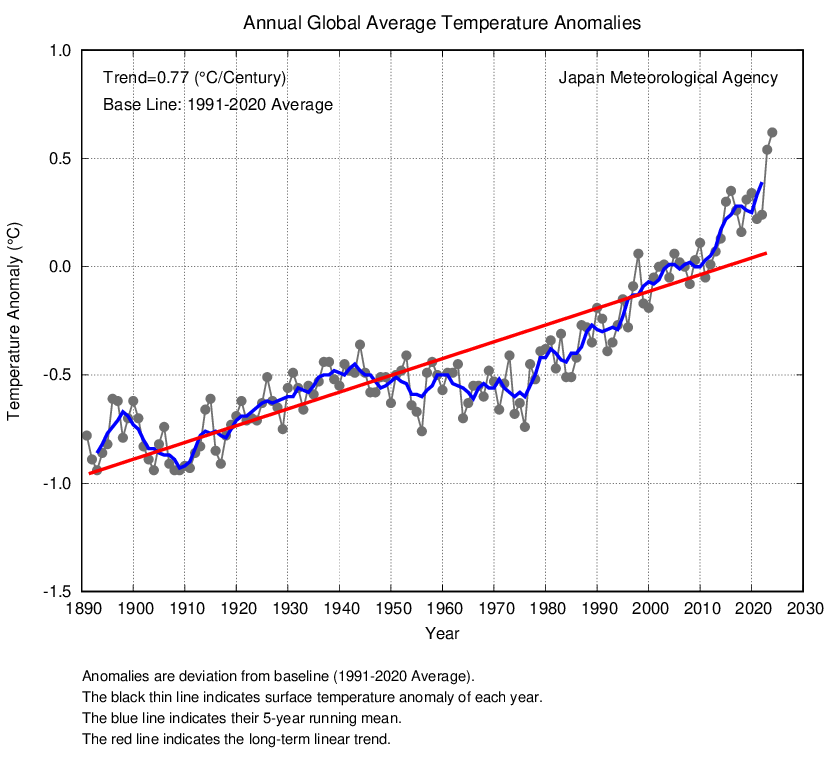
From which it's blatantly obvious that 1998 was an outlier and the trend was still there post-1998 even though it got weaker (as correctly noted and studied by the scientists).
Even an idiot can see that if you picked 1997 or 1999 or 1996 or 2000 or ... any other bloody year WHATSOEVER, the whole pause argument dies.
However, denialists disingeniously misused the 1998 outlier while relying on the public not to actually look at the data itself in order to create the pause slogan. And in that they were successful. Because as Lincoln correctly observed, "you can fool some of the people all of the time" which obviously is easy when the fools never bother to look at the data.
Of course with 2014 breaking the 1998 record, that means that the slogan didn't make it to "No warming in 16 years"
